HTML Responsive
What is Responsive Web Design?
- Responsiveness in HTML refers to the ability of a webpage to adapt to different screen sizes and
devices.
- Responsive design is the practice of designing webpages that can respond to the user's device, screen
size, and orientation.
- HTML provides the basic structure and content of a webpage, while CSS is used to style and layout the
webpage for different screen sizes.
- In responsive design, CSS media queries are used to target different screen sizes and apply specific
styles.
- Responsive design typically follows a mobile-first approach, where the webpage is designed for small
screens first and then optimized for larger screens.
- Responsive design involves designing the layout, typography, images, and other elements of the webpage
to fit and function well on different devices.
- HTML elements should be sized using relative units, such as percentages or ems, to ensure that they
scale proportionally on different screen sizes.
- Images should be optimized for different screen sizes and resolutions, using techniques like
responsive images and SVG graphics.
- Navigation menus and other interactive elements should be optimized for touch screens and smaller
screens, using techniques like hamburger menus and touch-friendly buttons.
- Responsive design is important because it provides a better user experience for visitors on different
devices, and can also improve the webpage's search engine rankings.
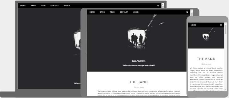
Responsive Web Design is about using HTML and CSS to automatically resize, hide, shrink, or enlarge, a
website, to make it look good on all devices (desktops, tablets, and phones):
Setting The Viewport
When creating a responsive web design, the viewport is the user's visible area of a web page. It varies
with the device - it will be smaller on a mobile phone than on a computer screen.
By default, the viewport is set like this:
width=device-width
height=device-height
initial-scale=1.0
user-scalable=yes
However, you should always specify the width and the initial-scale:
width=device-width, initial-scale=1.0
Tip: The viewport should be the first
tag in your
section.
Here is an example of a web page without the viewport meta tag, and the same web page with the viewport
meta tag:
Without the viewport meta tag:

With the viewport meta tag:
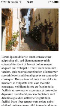
Responsive Images
Responsive images are images that scale nicely to fit any browser size.
Using the width Property
If the CSS width property is set to 100%, the image will be responsive and scale up and down:

Using the max-width Property
If the max-width property is set to 100%, the image will scale down if it has to, but never scale up to
be larger than its original size:
 xon
xon